Anchored in Boston. Building Beyond.
A premium builder creating exclusive homes all across New England.
Anchored in Boston. Building Beyond.
A premium builder creating exclusive homes all across New England.

Our Story
30 Years of Uncompromising Quality
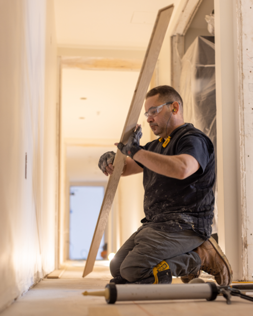
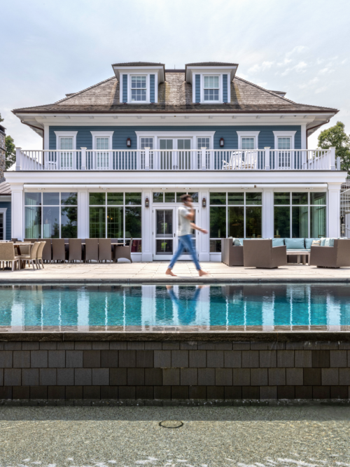
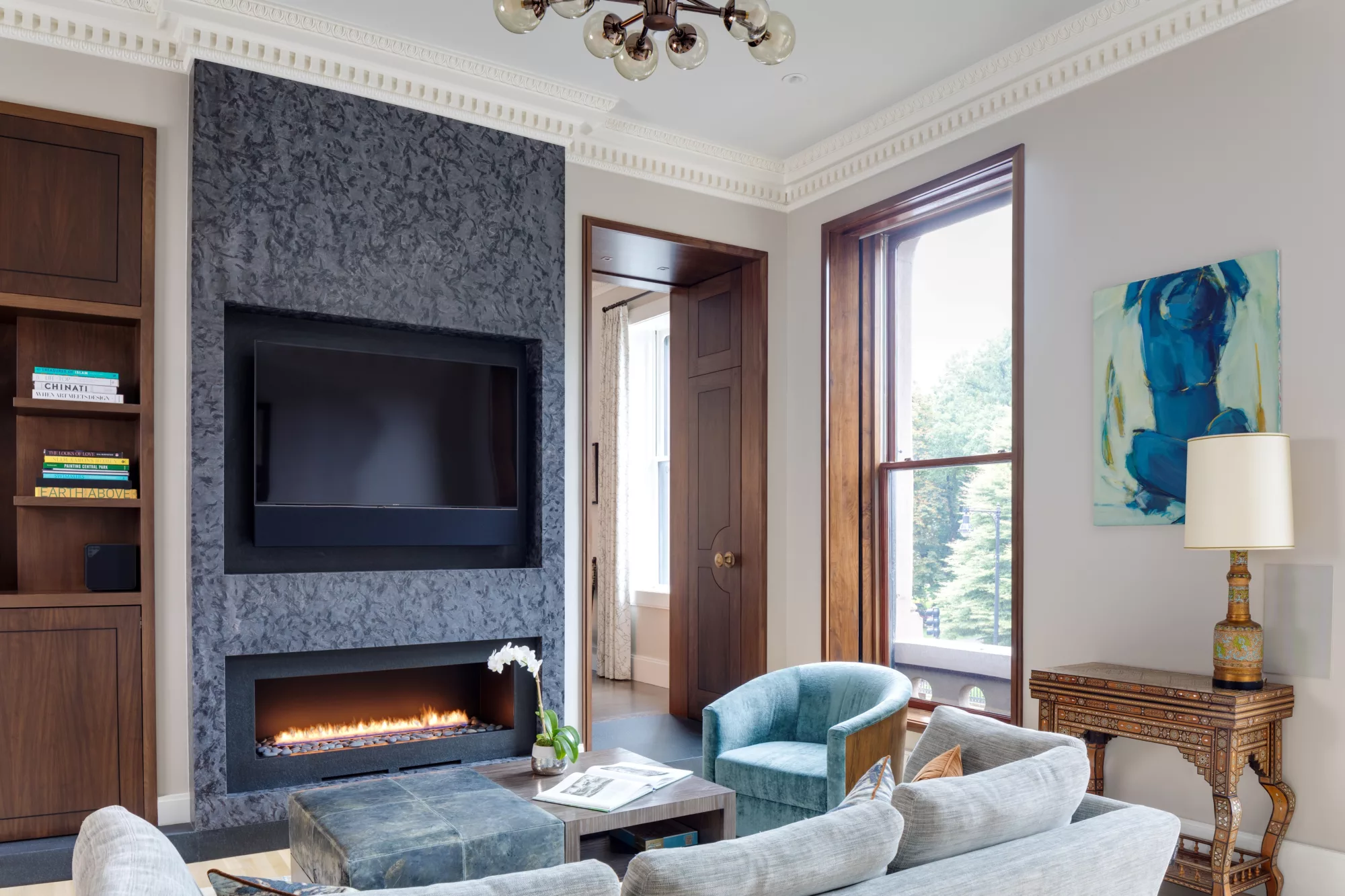
Based in Boston’s South End, Sleeping Dog Properties designs and builds unique, high-end residential and commercial projects throughout New England.
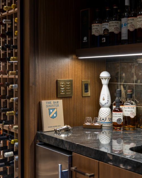
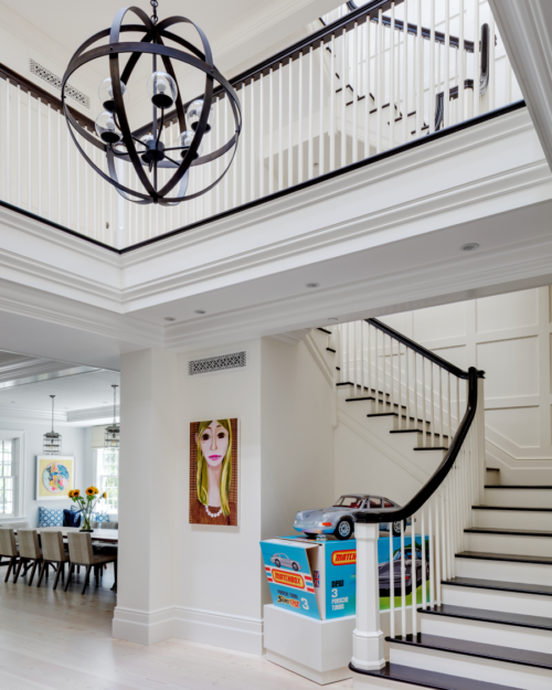
With a deep-rooted passion for design and an unwavering commitment to quality, we specialize in crafting homes that not only inspire our clients but also transform spaces into luxurious havens. Our team of skilled architects, designers, and craftsmen collaborate seamlessly to bring your vision to life, infusing each project with innovation, elegance, and sophistication.
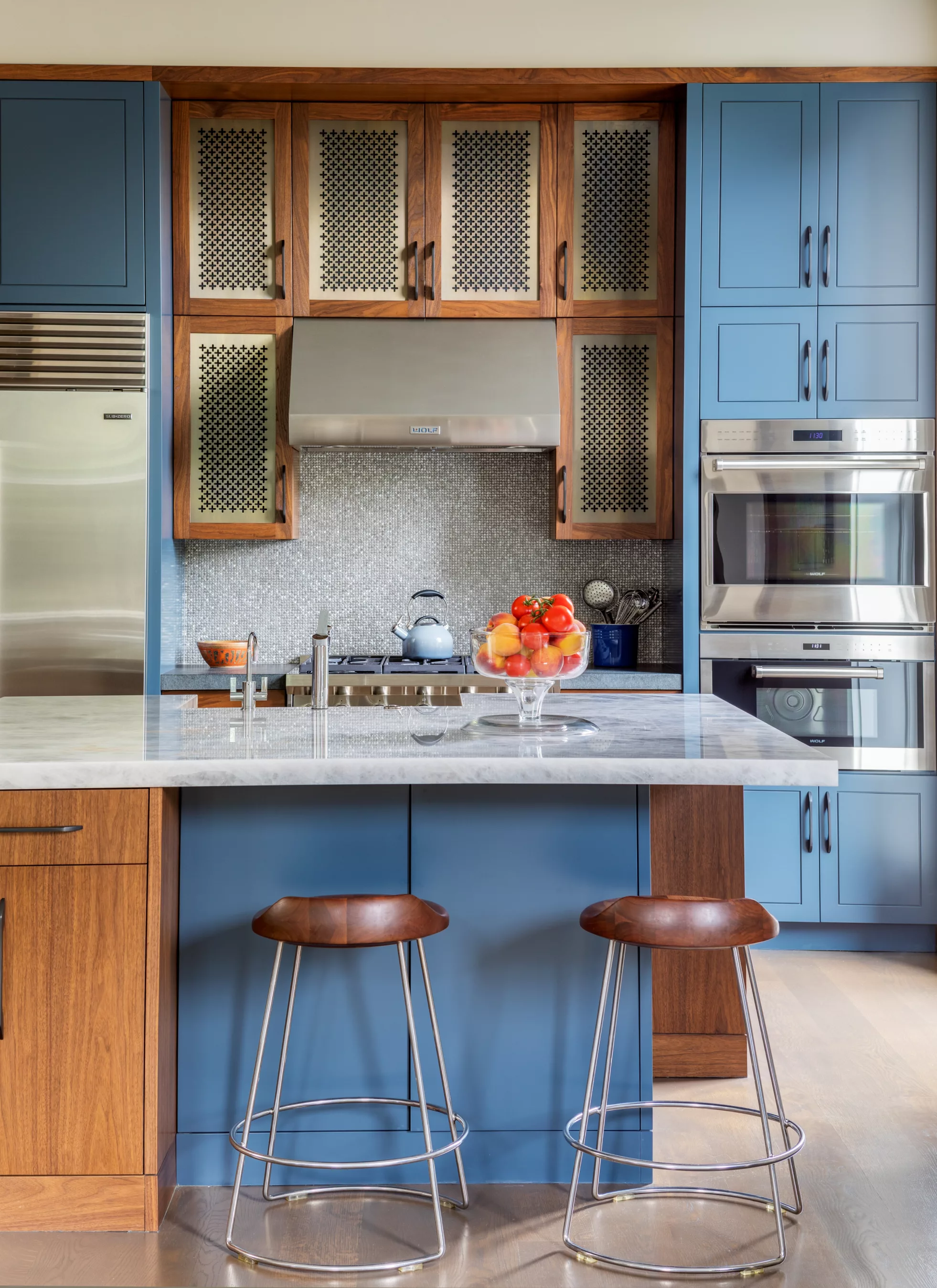
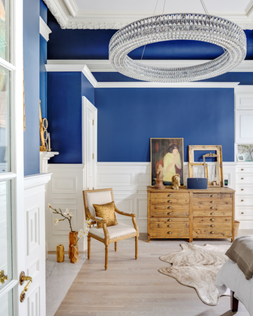
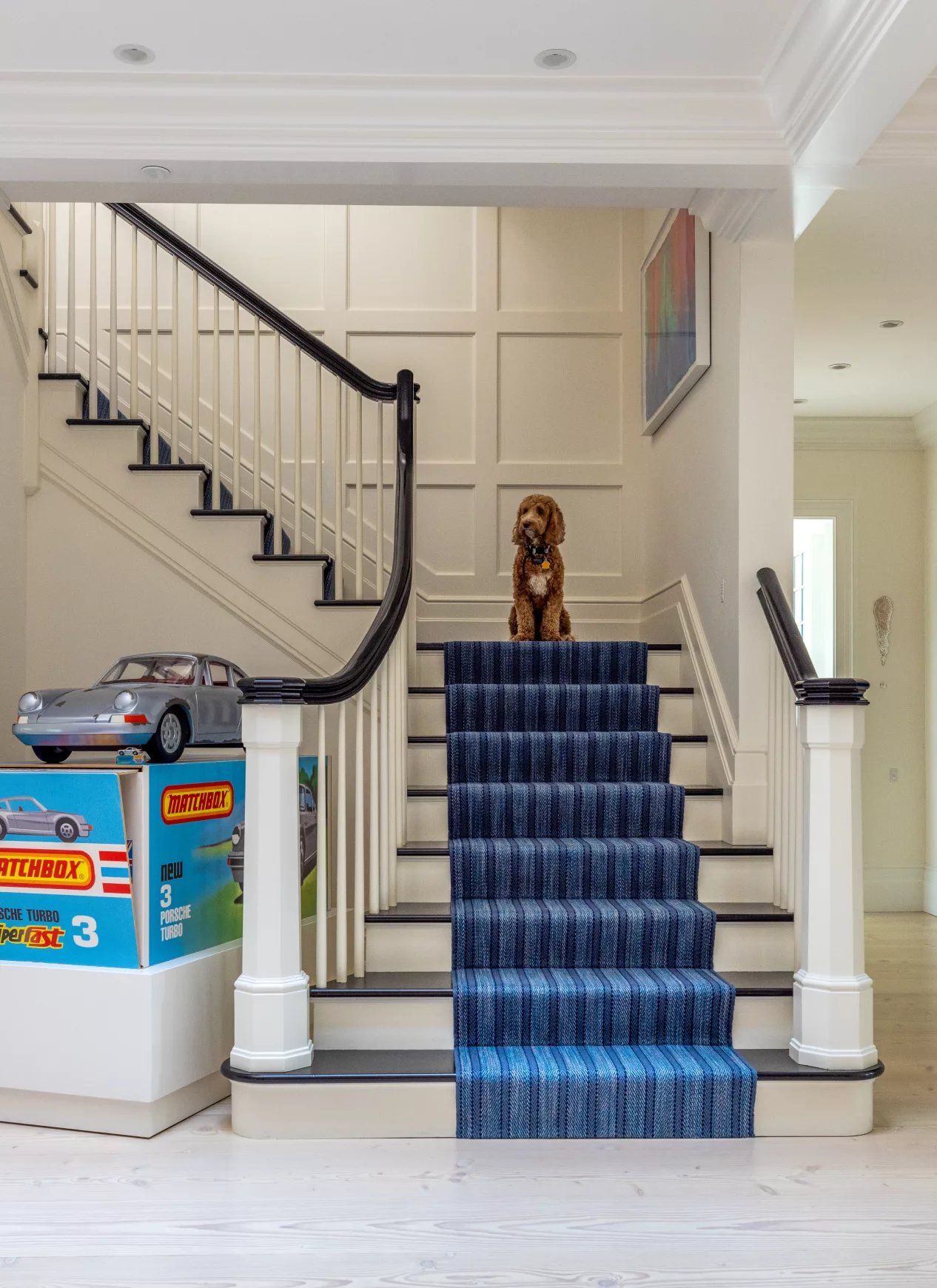
Our Portfolio
Featured Projects
Whether we’re collaborating with an outside architect and designer, or designing the project in-house — it’s always exciting to see how different minds come up with unique solutions and ideas. Combine these talented designers with our expert craftsmanship, and you end up with works of art you can’t wait to share with others.
About Us
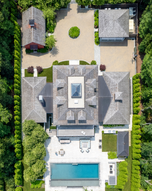
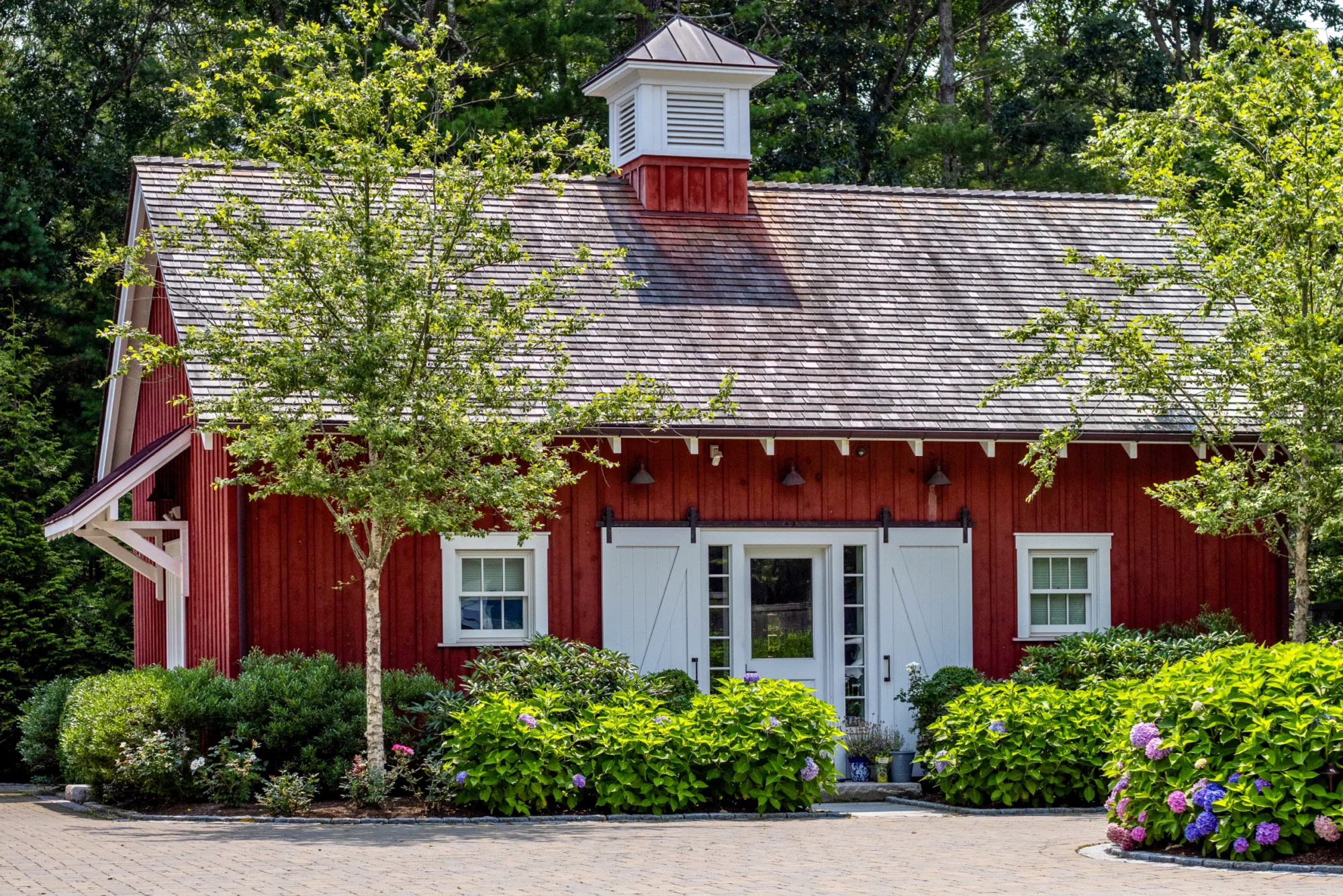
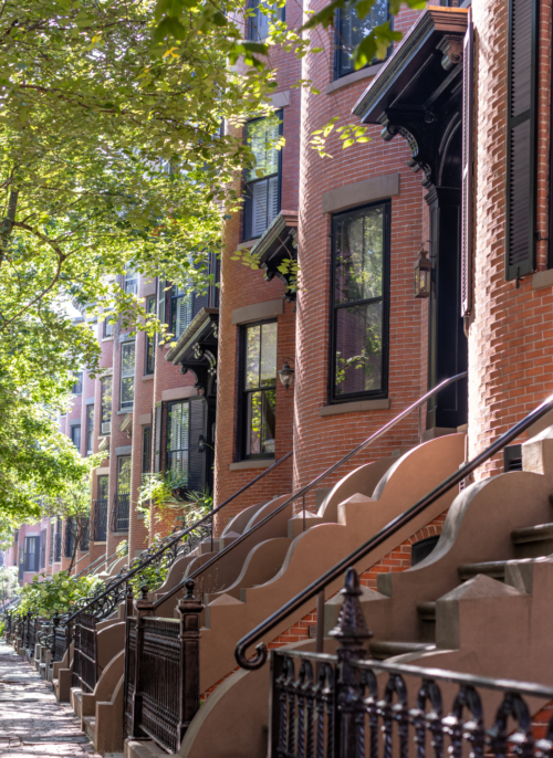
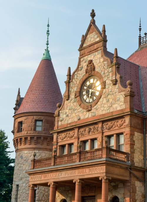
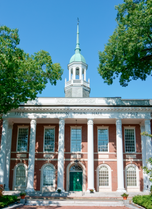
Where We Work
We have a deep understanding of Boston and extensive experience building in and around the city. So whether you live in a luxury high-rise or in a historic brownstone, we possess a wealth of knowledge to turn your home into a masterpiece. Beyond Boston, we’re constantly working with clients looking for more space in the suburbs or a relaxing vacation spot.


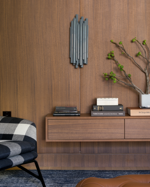
Our Expertise
Thoughtful Design. Built With Precision.
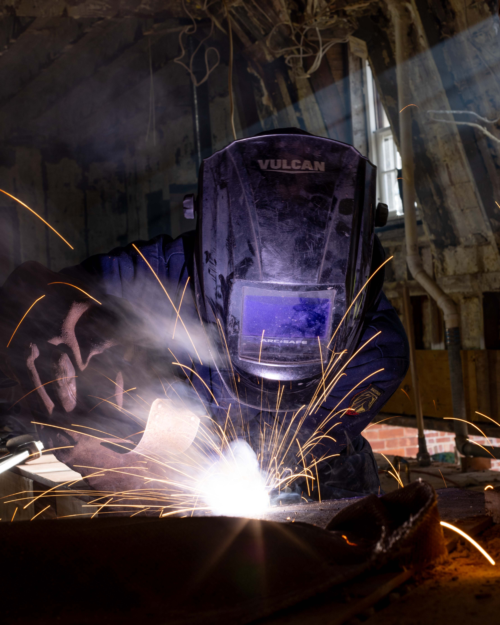
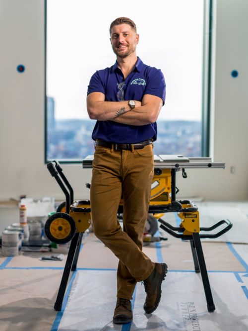
We admire the final product, but always celebrate the process.
@sleepingdogproperties